Redesign of the Career page logic
Telecom company
Role: UX/UI designer. Worked with marketers (2 people), HR (2 people)
Timeline: 2 months
Context
In 2025, the company compiled a list of values and designed it into
a physical and digital book with illustrations, and also began collaborating with IT institutes in its cities of operation, which created a need to develop a process for accepting internship applications from students.
Restrictions
cannot change the corporate identity.
it is important to maintain a friendly vibe and presentation.
the photo gallery and the tech stack must remain on the page.
Task
Analyze heatmaps and conversion rates, redesign the page architecture in collaboration with the marketing department, refine the careers section, separate values and working conditions into logical blocks, and add a clear path
for students.
Before:
After:
Research
Analysis of scroll maps and conversion rates together with the marketing department:
only 37% of users scrolled the page to the very end.
users scanned the page diagonally and lingered
mostly on photos and working conditions.there were clicks on inactive blocks, particularly on vacancies, meaning users expected these blocks to be clickable, but they were not.
Interview with the HR department:
HR personnel attend a large number of offline events and do not maintain social media profiles, so the website is their only point of contact and source of information. At the same time, the main goal of the website is to sell the product to the client, not to find a job seeker, so all the text is written in technical language for technical specialists, through the prism of financial benefit for the business.
When a student lands on the website, they do not understand the essence of the company's products, go straight to the "career" section, and cannot form a complete picture of the company (what it does, who works there). After that, they do not know how to write specifically about an internship, because all entry points lead either to a sales manager or to the HRD for hiring staff employees.
It became clear: the problem was not only in the page structure, but in the fact that the website in general was not designed for a non-technical audience and did not provide the student with either an understanding of the company or a working way to contact it directly regarding an internship.
Hypotheses
Hypothesis 1
If we simplify the interface and shorten the page, the share of users scrolling to the end will increase (it was 37%).
Hypothesis 2
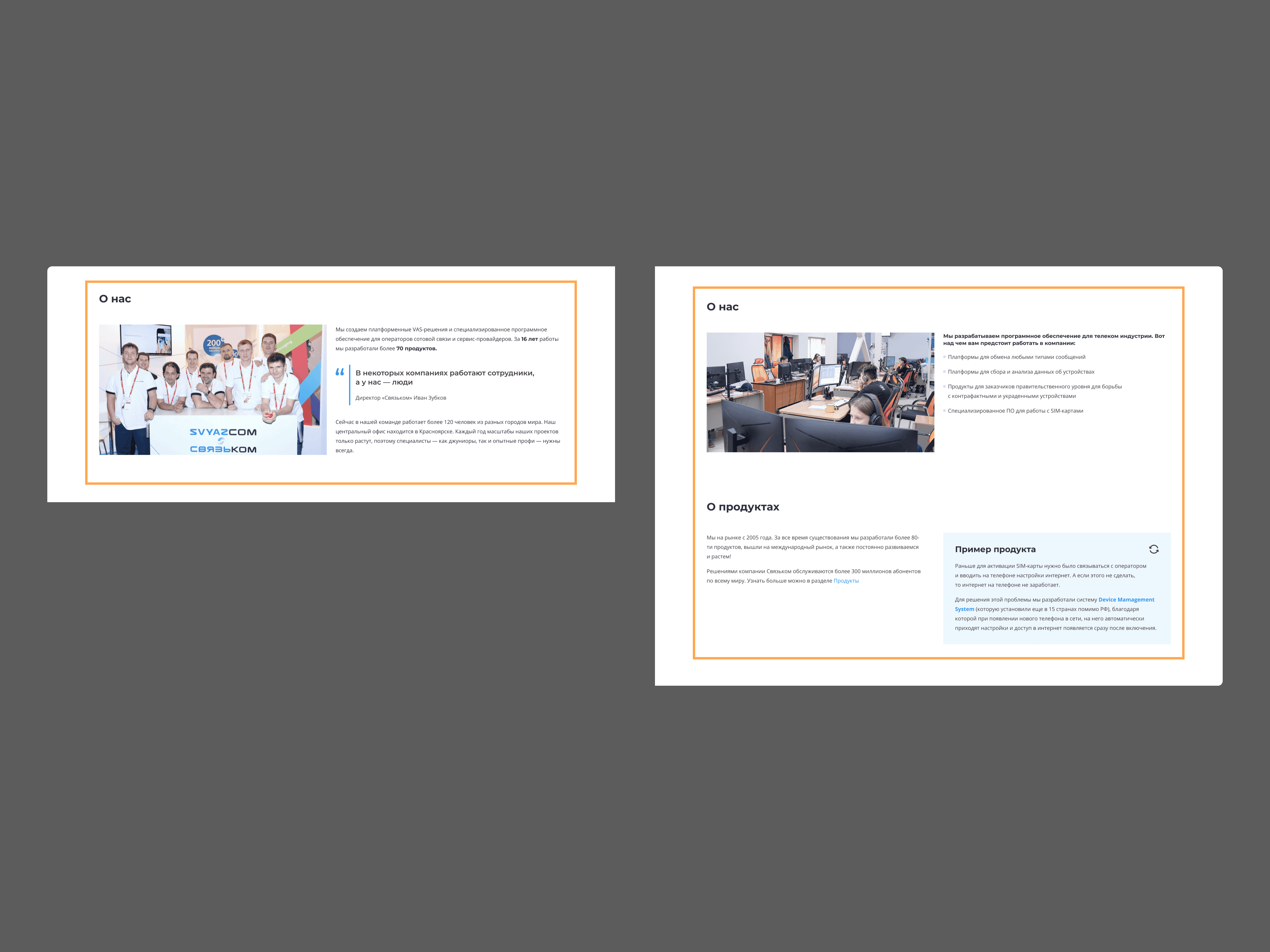
If you post reviews about the company and clear product descriptions, then after viewing the page, students will be able to explain what the company does.

Solutions
Before: a long page, only 37% scrolled to the end.
After: shortened the page, keeping what users hovered on the longest anyway (photos, working conditions), and removing less significant blocks. Preserved the corporate identity and mandatory elements (gallery, tech stack) unchanged.
Before: inactive vacancies looked like an inactive block that people clicked on anyway.
Now: made vacancies and company reviews a central, clearly interactive element of the page, and hid inactive vacancies (they will not open due to products leaving the company).
Before: values and working conditions were merged and lost in the text.
After: separated them into individual short blocks, values through a friendly presentation in the spirit of a corporate book, conditions through concrete facts.
Before: the website was written in technical language for a B2B audience, the student
did not understand what the company did.
After: added clear and interactive product descriptions designed
for a non-technical reader.
Before: the only entry points for communication are the sales manager or HRD
for hiring, there is no way to apply specifically for an internship.
Now: made a separate section for students with a direct way to apply for an internship.
Results
After the launch, we let students browse the website and asked what they understood. The answers showed that the solutions worked:
most were able to name an interesting fact about at least one, and often two of the company's products, meaning the technical essence was no longer a barrier.
participants understood how to apply for the internship, which means the new entry point
is clearly recognized by the students.they got the impression of the company as a team that supports its employees and always helps out, meaning the values block is perceived exactly as intended.